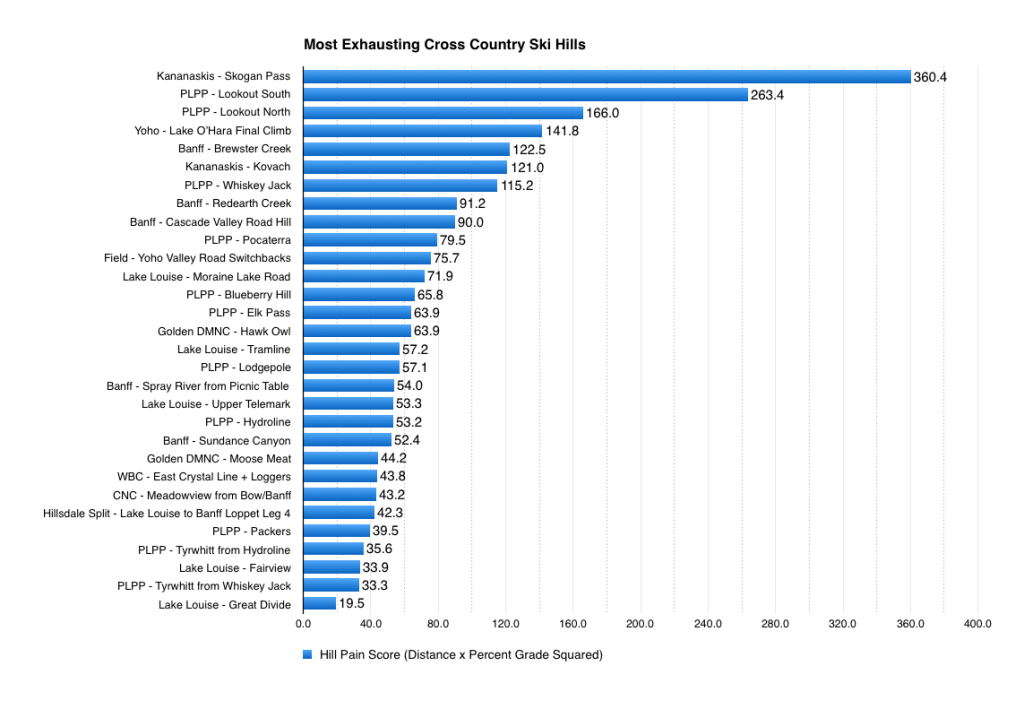
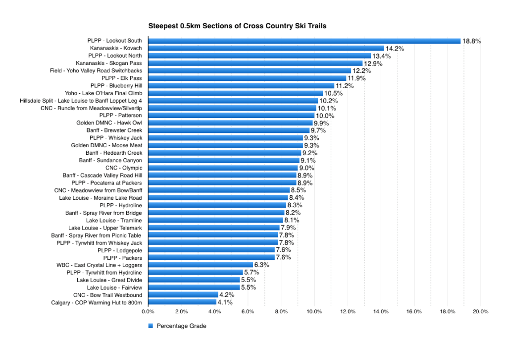
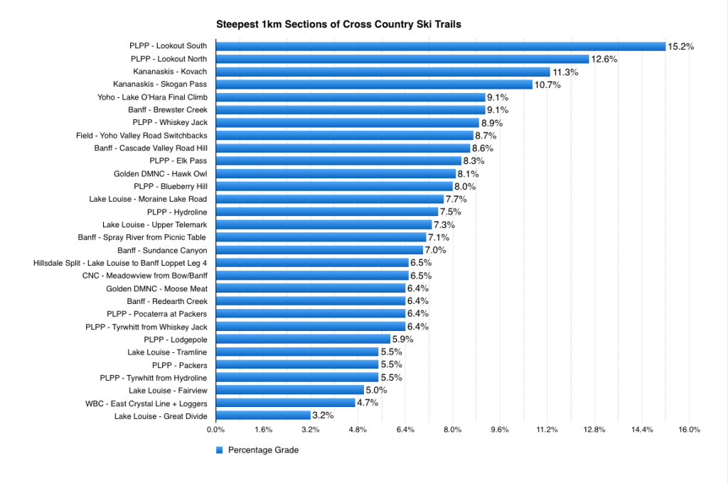
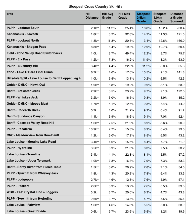
To make the most “apples-to-apples” comparison of the various hills, I selected the steepest half a kilometre stretch of each trail. I also made a graph of the steepest 1km stretches that I could find.
I chose not to make a graph comparing the average grade of differing lengths of hills, because I think such a direct comparison of slope would be hard to interpret. For example, Skogan pass maintains a 6.4% grade for almost 9km, whereas Yoho Valley road is at 21.8% for 300m. Both are impressive, but simply saying that 21.8% > 6.4% doesn’t mean very much to me.
As an attempt to overcome this conundrum, I put together a fun chart that somewhat accounts for both hill distance and slope. (The “Hill Pain Score” TM) This is of course super unscientific and needs to be taken with several grains of salt, because I weighted hill slope a totally arbitrary amount more than distance. The general idea was that a 10km 2% hill is much easier than a 2km 10% hill. Looking at the chart, I probably should have weighted for slope even more. Hard to argue that Pocaterra is more exhausting then MLR 😀
Anyway. Just for fun, right 😉
Hope you find these graphs as fun to look at as they were to make.
Risto


